Create professional custom t-shirts, hoodies, and apparel from any device – no app download required.Most online design tools were built for desktop computers, leaving mobile users struggling with tiny buttons, unresponsive controls, and frustrating interfaces. We built our design tool differently – from the ground up to work beautifully on phones and tablets.
The Problem With Mobile Design Tools
If you’ve ever tried to design a custom shirt on your phone, you know the frustration:
Buttons too small to tap – Constantly zooming in just to click the right option
Keyboard covers your design – Can’t see what you’re typing
Laggy and unresponsive – Touch controls that don’t work properly
Features missing – “Please use a desktop computer” messages
Pinch-to-zoom breaks everything – Accidentally moving your design when trying to navigate
We solved all of these problems.
Mobile Design, Done Right
Our online design tool automatically detects your device and adapts the entire interface for the best experience. The same powerful features you get on desktop – optimised for touch.
Smart Device Detection
The moment you open our design tool, it recognises whether you’re on a phone, tablet, or computer. No settings to change, no “mobile version” to switch to – it just works.
Touch-Optimised Interface
Every button, slider, and control has been designed for fingers, not mouse cursors:
Large tap targets – Easy to hit, even on smaller screens
Touch gestures – Pinch to zoom, drag to move, two-finger rotate
No accidental taps – Proper spacing prevents mis-clicks
Responsive feedback – Visual confirmation when you tap
Custom Mobile Keyboard
This is where most design tools fail completely. When you add text on mobile, the keyboard covers half your screen – and you can’t see what you’re designing.We built a custom keyboard specifically for design work:
Emoji support – Add 😀 🔥 ❤️ directly to your designs
Large keys – No more typos on small screens
Landscape Mode Optimised
On phones, our design tool works in landscape orientation – giving you maximum canvas space to create. Rotate your phone sideways and get a full view of your design with all tools accessible.
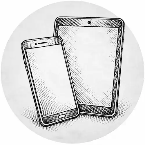
Works on All Devices
iPhone & Android Phones
Full design capability on your smartphone:
Upload photos from your camera roll
Take a photo and add it instantly
Design during your commute or lunch break
Send designs to friends for approval
Complete checkout without switching devices
iPad & Android Tablets
The perfect balance of portability and screen space:
Full desktop feature set with touch controls
Apple Pencil and stylus support for precision
Split-screen multitasking while designing
Ideal for client presentations
No App Required
Everything runs in your mobile browser – Safari, Chrome, Firefox, or Edge. No app store downloads, no updates to install, no storage space used. Just open the website and start designing.
What You Can Do on Mobile
Everything you can do on desktop, you can do on mobile:✓ Upload images (PNG, JPG, SVG, WebP)✓ Take photos directly from camera✓ Add and style text with custom fonts✓ Position, resize, and rotate elements✓ Design on multiple print areas (front, back, sleeves)✓ Preview on product mockups✓ Select colours and sizes✓ Add to cart and checkout✓ Save designs and return later